The Psychology Behind Color Choices in Branding: What Your Palette Says About Your Business
When it comes to branding, your color palette is more than just pretty shades—it’s silent messaging. The colors you choose instantly shape how people feel about your brand (often without them even realizing it!).
Why Color Matters:
Did you know 85% of shoppers say color influences their buying decision?
Colors trigger emotions, moods, and perceptions. Your brand palette can make you feel trustworthy, bold, luxurious—or even fun and quirky.
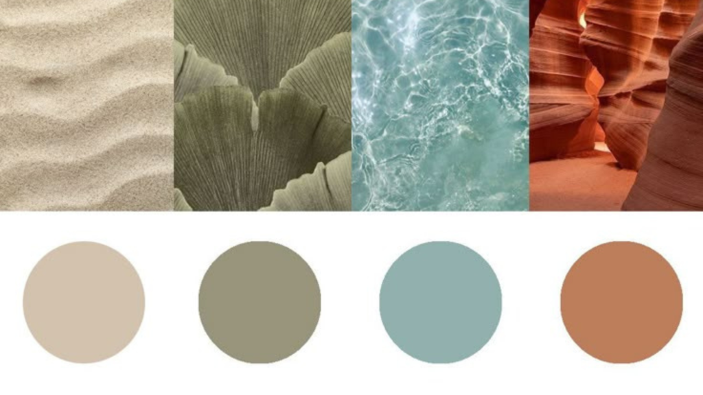
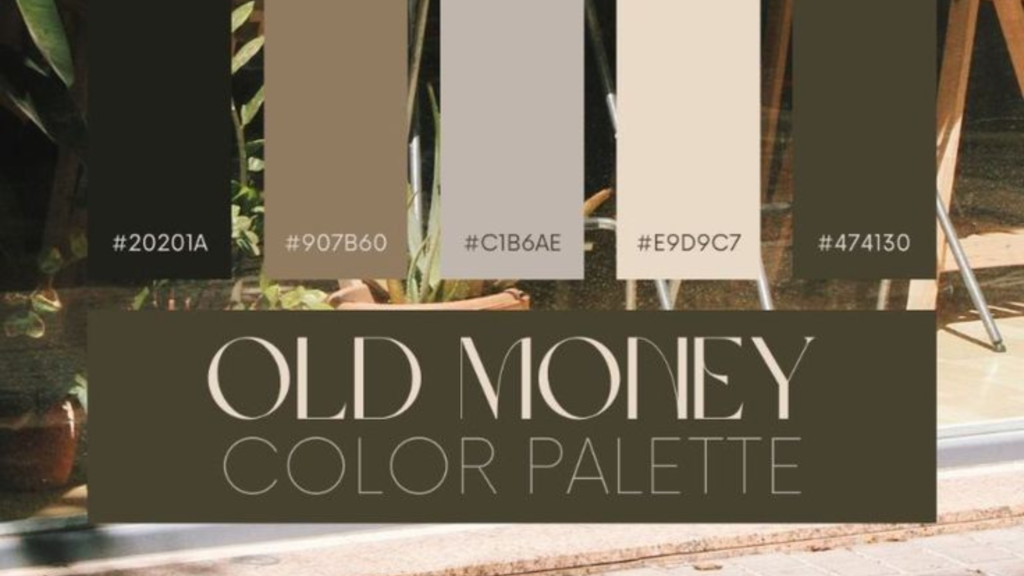
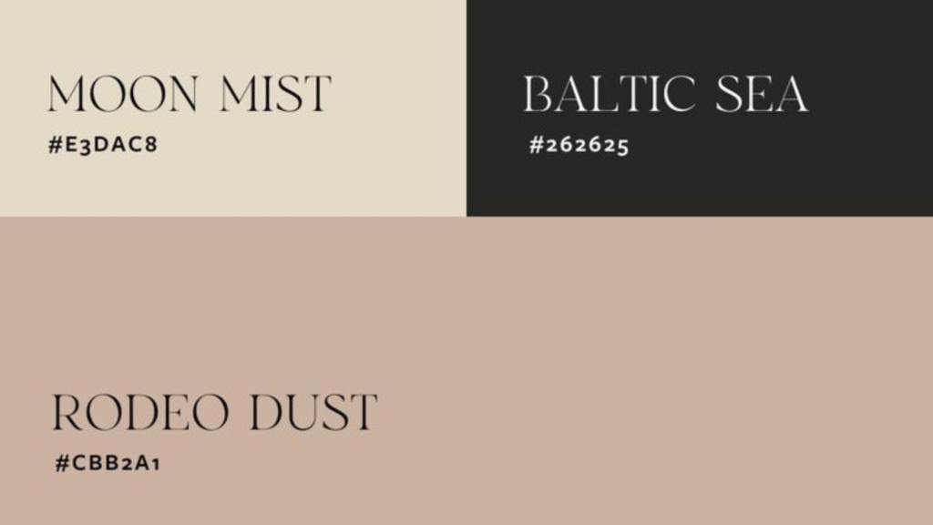
What Popular Colors Say:
🔵 Blue: Trust, reliability, calm (Think: LinkedIn, PayPal)
🔴 Red: Energy, excitement, urgency (Think: Coca-Cola, YouTube)
🟢 Green: Health, nature, peace (Think: Whole Foods, Spotify)
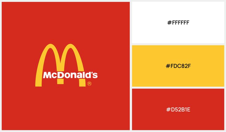
🟡 Yellow: Optimism, warmth, friendliness (Think: McDonald’s)
⚫ Black: Luxury, power, sophistication (Think: Chanel, Apple)
🟣 Purple: Creativity, royalty, wisdom (Think: Cadbury)
How to Pick the Right Colors for Your Brand:
1. Know Your Brand Personality:–
Are you calm and professional—or fun and bold?
2. Understand Your Audience:-
What feelings do you want to spark in them?
3. Stick to a Cohesive Palette:-
2-4 colors max. Consistency = recognition.
Common Color Mistakes:
❌ Using too many shades
❌ Ignoring contrast (for readability)
❌ Forgetting what your audience feels about certain colors (Example: Red can mean ‘sale’ in retail but ‘danger’ elsewhere!)
Final Thought:
Your brand colors are like your silent ambassadors—they speak before your words do. Pick them wisely, stay consistent, and let them reflect your brand’s true vibe.
Need help choosing the perfect palette for your brand?
Let’s create a color story that truly connects.